Market Risk Map is a new on-chain analysis indicator introduced yesterday by cryptocurrency market analyst @TheRealPlanC. It presents a 10-point risk assessment scale for the Bitcoin (BTC) market. Currently, it is in the moderate “HODL area” with a value of 4.6.
Almost every day, new ways are born to exploit the advantage that on-chain analysis provides in the cryptocurrency market. Yesterday, an interesting new Market Risk Map indicator appeared, which aims to estimate the relative investment risk in the BTC market.
Its author is an analyst @TheRealPlanC, gaining increasing popularity on crypto-Twitter. He recently proposed the so-called Market Reversal Indicator, which recently turned green, signaling the beginning of an uptrend.
ហានិភ័យទីផ្សារ Map in the HODL area
The Market Risk Map indicator resembles Bitcoin’s well-known rainbow chart, which shows degrees of relative risk in the market. It includes a 1-10 scale that helps you assess the upside or downside potential. According to the creator, the Market Risk Map scale can be divided into 3 parts:
- red: 8-10 – sell area
- blue: 4-7 – HODL area
- green: 1-3 – buy area
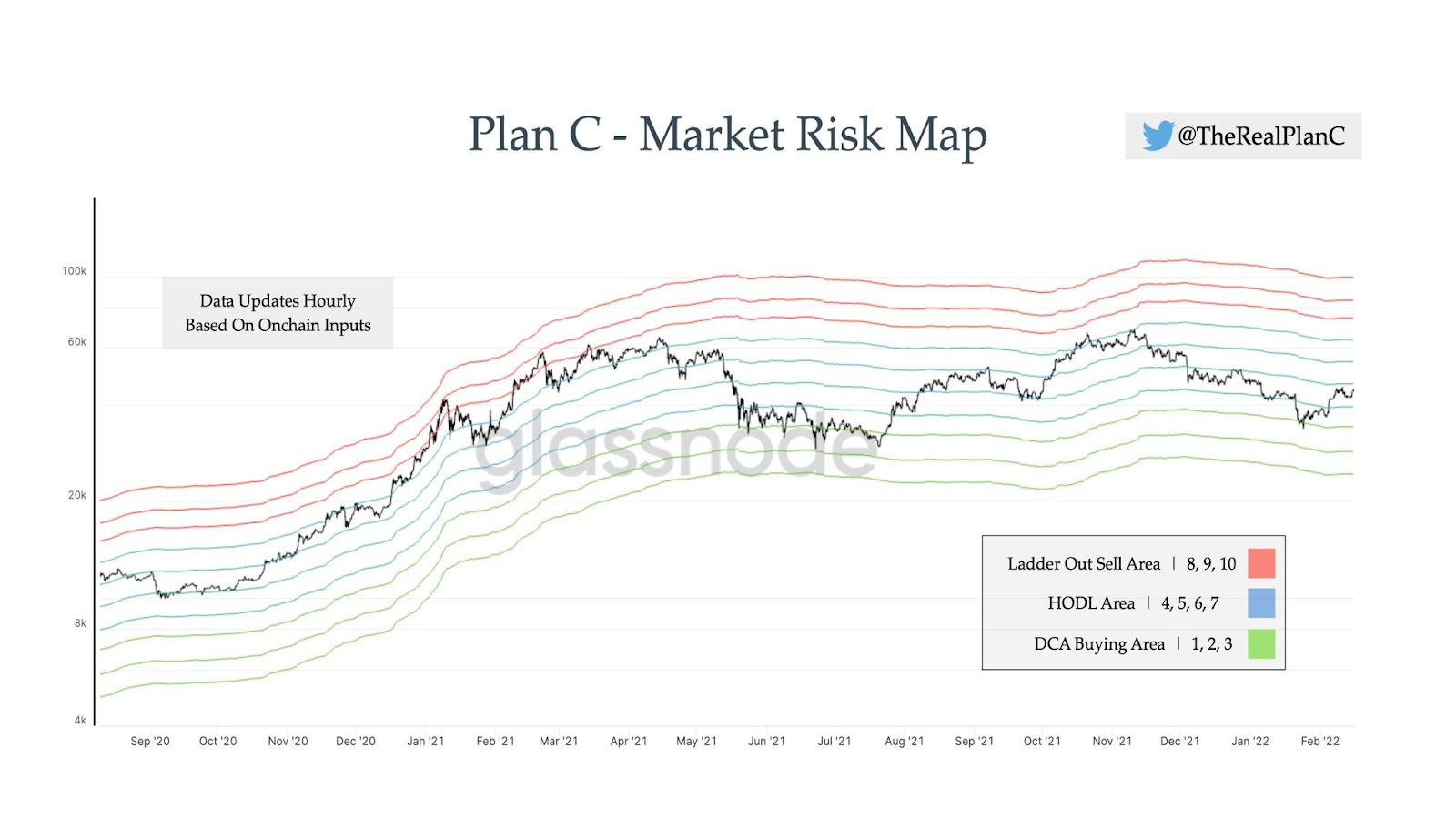
According to @TheRealPlanC, the current value of the indicator, for a BTC price of $43,000, is 4.6. Interestingly, the extreme values for the current market situation are, according to the indicator, $24,274 for a risk level of 1 and $99,284 for a risk level of 10.
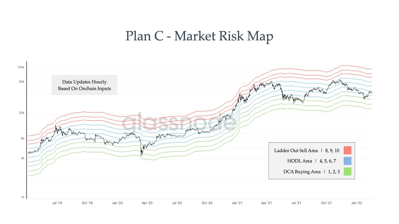
Indicator for long-term investors
The performance of the indicator within a long-term Bitcoin chart is also interesting. Its creator tweeted a chart going back to early 2019. It turns out that the price of BTC was within the given scale at all times.
Only once did the price reach the extreme buy area of 1. This occurred during the COVID-19 crash in March 2020. On the other hand, in the last 3 years, the price has not once reached the extreme risk level of 10. Three times, however, it has reached the level of 9. This happened during the upswings of June 2019, as well as in January and March 2021.
The author does not disclose which on-chain indicators he used to build the Market Risk Map. Instead, he មតិយោបល់ that it should not be used by short-term traders, but is a tool for long-term investors:
“Just to be clear this is meant to be used by long-term holders that want to play the multi-year market cycle and know when to take some #BTC off the table and when is a good time to DCA more in. It is not meant to be used for swing trading on shorter time frames.”
លើសពីនេះទៀតនៅក្នុង ធ្វីតមួយទៀត, he explains that the colored areas he introduced do not have to be orthodoxly played by their assigned names.
“You can for sure DCA in during the HODL area, especially 4 & 5, however, it is just important to understand your relative risk. The higher the score, the more risk you are taking on.”
សម្រាប់ការវិភាគ Bitcoin ចុងក្រោយ (ប៊ីស៊ីធី) របស់ប៊ី។ អ៊ី។ គ្រីបកូ, សូមចុចទីនេះ.
ការមិនទទួលខុសត្រូវ
រាល់ព័ត៌មានទាំងអស់ដែលមាននៅលើគេហទំព័ររបស់យើងត្រូវបានផ្សព្វផ្សាយដោយស្មោះត្រង់និងសម្រាប់គោលបំណងព័ត៌មានទូទៅតែប៉ុណ្ណោះ។ សកម្មភាពណាមួយដែលអ្នកអានអនុវត្តលើព័ត៌មានដែលរកឃើញនៅលើគេហទំព័ររបស់យើងគឺប្រឈមនឹងហានិភ័យរបស់ពួកគេ។
Source: https://beincrypto.com/risk-market-map-indicates-bitcoin-btc-is-in-the-hodl-area/